The ProcessMany of the images are very high quality and therefore large file sizes, so they might take quite a while to load. I then changed the Resolution from 72 pixels per inch (PPI) to 300 ppi. Although this does mean that the file size is increased nearly 20x its original (from 1.34MB to 24.9MB), it's important to do this as a lower resolution would not be sufficient for printing. Higher resolutions on the pictures used to create the magazine cover, coupled with the industry printers, the colour tones are richer, there is more depth and detail to the picture and it's less pixelated. The reason Photoshop uses 72 ppi is because most computer screens display pictures at this resolution, so for things like online media, this is perfect, as it's detailed enough to be crisp on a screen, without the file size being unnecessary and wastefully large file size (which in this case would take up server space and/or slow the loading of the web page that the photo is on). If I kept the resolution at 72 ppi, when the magazine is printed the reader would be able to see grain, fuzziness and the actual pixels that make up the image, which would look extremely unprofessional and unattractive to readers. The industry standard for printed media (including photos, magazines and posters) is 300 PPI. I set the colour mode to 8 bit RGB, which again is the industry standard for print media. I set the background as transparent to save a bit of time during the creating process, and also remove and bias a totally white/black background might cause. I left the Colour Profile and Pixel Aspect Ratio on their standard settings because the default selections are suitable.
A this photo was taken from a professional photo-shoot, I didn't need to do much work on it, as it had already ben photoshopped, and the levels, contrast, brightness etc. had already been edited to create an almost vintage effect on the image. Bit I cut out each person in the picture using the magnetic lasso tool, and then refined the selection using a smart radius to get the detailed outline. I then cut out the old background. Then I increased the Canvas size by adding 10% to the top of the photo to allow more room for the mast head when it's added and created a new background by sampling the darkest and lightest colours of the old background, and creating a gradient with the radial preset. This gave the background a professional studio lighting effect, which in my opinion is better than the one on the original image.  The colours in the photo - Hayley's hair, orange, and the background, (midnight) blue - slightly match one of my sample colour schemes from earlier research, and I wanted to make sure that the text and other graphics I use on my mock up fits a colour scheme. so knowing that black and white would be two of the 5 colours in my colour scheme, I created a new one using the Adobe Colour CC online software. I used photoshop to find the HEX Values (every colour has an individual hex value) for the background (this was a gradient so I sampled the darkest part of the background) and also an orange that was close to that of Hayley's hair. I put them into the interface and get this new colour scheme, which I'm going to use on my google mock up. I added the Savage logo that I made previously, and gave it a slightly red outer glow, I thought this made it stand out more and look a lot better. I used the red from my colour scheme, and along with the black I think it really helped to bring the logo into the cover and help it match the rest of the content. So here's the first logo above the background for the magazine, I noticed it didn't really stand out or look very special.   I then applied a layer mask (I used the image of the band to create the mask to make it perfectly fit) to the new logo so that the woman in the middle of the photo would be able the logo, but the men would be behind it - giving a popping, 3D effect which is an extremely convention of mastheads. By using a layer mask and not just rubbing out the original layer, I'm still able to edit the logo and re-size it without having the rub anything out/erase anything again.  And finally I re-added the picture of the band. 
I made the skyline using a default font, and the colour scheme orange, white and black. I used the same red glow effect on the black text showing the website as I did on the Mast Head, although this is hardly noticeable on screen, it will create a really nice effect on print, and also when it's not there it's noticeable.
I used orange and white to make the skyline pop out and attract the reader's attention, and also advertise the competition to win prizes. I used the words 'Merch' (slang for branded merchandise sold by bands) and 'inc.' to make it look less informal and create a relaxed and easy going vibe.

I added "www.savagemag.com," as this would be the website for my Magazine. When I checked to see if this domain had already been registered, I found that another publication company called Paisano Publication, LLC. had already registered the domain and were using it to forward to their website. I used a WHOIS database lookup to see who registered it and make sure it wasn't up for sale (left).
So I just changed the domain to one that isn't registered by adding a dash in between Savage and Mag, so :

Godaddy is an award winning domain seller, and I could get Savage-Mag.com from them for just £2 a year for the first two years (and then £10 per year after the first two years). I could also get the .co.uk, .info, .net and .org domains as well for fairly cheap.
 The finished text looked like this when I scanned it in: 
Up close you can see the way it's outlined and the lines inside it. I was trying to create that 'teenager's diary doodle' sort of look and I'm really pleased with how it turned out.

I did some photoshop magic and selected all the white in the photo, inverted the selection and refined the selection to get an outline, I then remove the background, played with the brightness and contrast and edited the image at a pixel level to make sure it was all even and there was no dark/light spots in he inner shading. finally I was finished, and had:
I made a footer using the same technique as the header, and added Iron Maden, ACDC, Enter Shikari, Guns N' Roses and Muse. I then put the Paramore font onto the front of the magazine upon an orange background and tilted it a bit: 
I then added a slight shadow to it by duplicating the layer, making the orange colour black, Gaussian blurring the whole thing, and then moving it down and to the left about 5 pixels.
  I then used a whole range of photoshop techniques, effects and actions to create a polaroid printed image effect on some pictures and added them (with text that matched the house style and colour scheme) to my magazine cover:   
On the last picture (right, below) I edited in some tape and made the shadow come out a bit at the bottom sides and not be visible at the top. The shadow made it look like it was coming slightly off the page, and held on my the tape.
 And finally I edited in the barcode (I just found a generic one online) and made a small graphic for the 'Win a T-shirt' splash. I did this by getting a picture of a plain black T-shirt from the internet, and editing on a white Savage logo, I then cut out the background and placed it in a red box with the text. For the text I used two different fonts, but to make it look bold and stand out I changed the 'stretch' of the text so that each line on the left column was the same width. I then rotated this new graphic slightly and added a background.  I'm going to get some feedback from some different people and change some things I/they don't like until I like the mockup.

My favourite is probably the red

After speaking to some different people about their opinions, I've found that like myself, a lot of people like the red block colour scheme, but some other information I received was that the main title would look better in all caps and possibly a different font; and that the main text should be a different font. The second piece of advice I was given was to change the main box in the middle to be slightly less of a box, maybe I could make it look like ripped paper or something.
I started by making the ripped paper look. I got a picture of a piece of ripped paper and put it into photoshop.  I then used layer blending to make the paper red, and cut out the background.  And then I put it onto the original image  Just to shake things up a bit, instead of putting the shadow on the outside, I put it on the inside making it look like the instead of it looking like a piece of paper being ripped out and stuck on top of the current magazine, it looked like the cover had been ripped and the Paramore text was behind it. 
I really like the way that this offers contrast to the square competition section.
Then I started on the new font, I used a pre-existing block serif font, and with a graphics tablet I created a similar typeface as before but all digitally. I like the way it looks more like an american collage or other institution logo, which in my opinion added to the scrap book sort of affect I've been building on.  I then replaced the old typeface with the new one, which left me with this magazine:   DOUBLE PAGE SPREAD
My first double page spread mock up:
  I did some tumblring to gain some inspiration for my DPS, and here are some of the graphics that I found, which I found inspiriting.  
This time, along with Photoshop I used another Adobe software called InDesign to create the Double Page Spread. InDesign is used a lot in the publication industry, and although I don't have any experience with it, I tried to pick things up as quickly as possible. I created all of the graphics within photoshop and then exported them into indesign to position and then export. InDesign is useful as it has things like text wrapping, which is important and time saving. I used these settings when creating the document:

For my second DPS, I used the same sort of house style and colour scheme as my cover, which I thought worked really well. I created a new font for the "5 Years in the Making" header by combining 4 different fonts, and used my research of typefaces in the decision to use a serif font in the paragraphs.
I used two columns as this is a convention, but I also went against conventions in the positioning of the main photo. Usually the model would be looking at the camera or at the article, but I made positioned the photo of my model so he was looking the other way, symbolising the new start that the band is making, and linking in with the text.
I was going to make the text alignment "justify", which means the paragraphs are square, which a lot of magazines do - but I decide against this as I didn't think it went with the casual, 'hand made scrapbook' sort of style from the rest of the page. But I used a drop capital as this is a strong convention within the industry.
I really like the way that the colour scheme and the separation of the two main colours creates a sort of yin and yang effect, and I've coloured the polaroid style pictures to fit in with the colour scheme.
In the top right hand corner I have put the magazine logo and the page number under what looks like a rip in the page. I really like the way it's come out and I think it works with the rest of the double page spread.
 I've made a simple effect in the middle of the page to show the page fold, but although I put a lot a thought into the exact positioning of the photo of the model, I'm worried that the face may look distorted when the magazine is left out and not pressed down flat. As a little experiment I created another 3D mockup of page, showing the worst possible distortion; and it looked completely fine. There's minimal distortion of the face, and the whole DPS works really well.  Looking back now at my first DPS design, I'm really glad I created a new one. The first one was, in a word, awful, but I really like the new one and I think it works really well with the style of my magazine as a whole, and the genre I'm trying to focus on. Using existing images from the internet, use Photoshop to create
1x mock up of
a front cover,
1x contents
page
1x double
page spread.
|
Thursday, 1 October 2015
Google Mockup Ideas


Double page spread house styles

Kerrang has a different, individual 'House Style' for each one of their Double Page Spreads, but they generally keep the same conventions - as you can see in the gif I've created above.
House styles are created in individual DPS' through the use of a colour scheme, usually 3 main colours, and through the use of fonts. Kerrang usually uses an artistic decorative font for the Headline, and maybe some other sub titles, and then they generally use sans serif, bold fonts for the other main text, and then either serif or sans serif type faces for the wording of the magazines.
The main image generally covers the whole of one or both pages, and care is often taken to make sure a main feature (e.g. artist's head) isn't in the midsection where it would be warped by the curve in the physical paper.
the main featured article is then placed around the main image, and other images are also sometimes added.
Contents Page and House Style
I'm going to use Kerrang as an example to show how a magazine creates a house style with their contents pages. Kerrang has strong conventions which they follow in almost every contents page, they always use the same layout. I've made a gif to illustrate how they do this:

A house style is "a company's preferred manner of presentation and layout of written material."
So for a start it's clear that a strong component of Kerrang's house style is the fact that they use the same layout every time. They also use the same fonts, text sizes and colours - as you can see above.
These fonts and colours are conventional among the whole magazine, for example the Kerrang logo font is used on the cover, and the same capitalised sans serif fonts are often used.
Colour scheme ideas, Name Ideas and Feature Story Ideas
-From looking
at exiting products show some colour swatches of successful colour schemes
and decide on the colour scheme you will use for you product and explain your
choice.
-Choose a
variety of name ideas (at least 12) for you magazine and explain your choices.
State what your final choice is for the name of your magazine and the reasons
for this.
-From looking
at existing products state a variety of cover stories and content features
that you think will appeal to your target audience.
Some successful colour schemes Here's the photoshop template I created and used to make the graphics bellow, I found photos of 3 major magazine covers online, and then used the online application palettefx.com to create an overall, non bias computer generated colour scheme of the magazine. The online software finds harmonious colour chords based on the spectrum of colours that make up the magazine, including the text, main photo and any other graphics.       The cover is sampled using a unique algorithm developed by graphic designers and a colour palette is created "with a diverse sampling of vibrant hues". The colour pallets are then put behind three main colours that I thought stood out the most. With the two Rolling Stone magazines, I used the text to find the three colours, and with the other 4 magazines, I looked at the picture overall, and picked out the three colours that I thought stood out to me the most. I found that a black and white appeared a lot, and this was mainly due to the text, but also red, yellow and a lot of pastel/tertiary colours were also used, these came mostly from the skin tones and clothing worn by the models. My magazine will incorporate a Red and Black colour scheme. As my magazine is going to be a Punk Rock magazine, the Kerrang colour scheme is important (as it's a similar magazine), I need to look at that for inspiration on what should be my third colour. Kerrang uses yellow, which is a bold primary colour. I obviously want my magazine to differ, so I used Adobe's Colour Wheel online software to help choose the third colour. I used the Triad, Complimentary and Compound colour rule settings to find an overall colour scheme for my magazine.     So from these colour schemes, my options for the third colour are: Orange, Green, Cyan Blue or Yellow. I'd also use white for text, but I'm not including this as one of my main three colours. My favourite colour scheme is the last picture (so: Red, Yellow, Cyan Blue, Black and White), but I'm going to experiment with all of them when I get onto actually designing the cover. Name IdeasI've decided that I'm going to create a Punk/Punk Rock magazine, I made this decision based on the data I received in the survey I created. I've generated a list of name ideas that are derived from jargon and other words associated with this genre of music.I really like how 'Rolling Stone' is a play on words, from 'Rock and Roll', so I'd really like to have a magazine name which has some sort of similar twist. I did a lot of research to find words that either reflected Punk Rock ideologies, are common jargon/lingo of the genre, or that had connotations connected to the genre or the people that produce/consume the genre's music. Although the list I found seemed infinite, the best I found were: - Rockabye (Explained in 'Top Picks' section) - Punk Rock (Self Explanatory) - Anarcho (Punk Rock has archaistic ideologies, Anarcho is also a sub genre) - Riot (Terminology associated with Punk Rock's anarchistic conventions and ideologies) - Youth Rock (Punk Rock is all about youth revolt) - ProtoPunk (Prototype being individual, also genre that influenced modern Punk music) - Savage (Fierce, Violent, Uncontrollable - all conventions of a Punk's persona) - Nihilist (Rejection of morals/religion - believing life is meaningless - Very Punk) - Patch (Conventionally, Punk's wore jackets with 'patches' on - connotes strength) TOP PICKSRockabye
Rockabye is a word almost everyone knows due to it's use in the nursery rhyme "Rockabye Baby," I really like the twist this has and the contrast in connotations it would provide when it entitles a punk/rock music magazine. The fact it has "Rock" in the name is an obvious indicator that the magazine is a Rock magazine. It also has the same first two syllables and 6 letters as Rockabilly, which was the earliest form of Rock and Roll - the words are connected by rockabye reminding people of childhood, early life; and rockabilly reminding people of early rock and roll. The nursery rhyme is the foundation of music for many people, so this name could symbolise the foundation of Punk/Rock for them too.
Savage
Savage is a short and snappy magazine title. Fierce, Violent and Uncontrollable, represents the stereotypical Punk. Savage is also common slang used by youth to denote something amazing, or someone that "just doesn't care", both of these things may be descriptors of a famous Punk, in the opinion of a Punk fan.
Conclusion
To decide which name to use, I surveys a small focus group of 20 people, and asked which name of magazine they would most likely buy, knowing it was a Punk Rock music magazine.
The results were:
17 people preferred Savage
03 people preferred Rockabye
Therefore I'm going to call my magazine Savage
To see how I made the logo "Savage" for my magazine, click here. Feature Story IdeasCurrent feature storiesI looked at an array of different Punk/Rock magazine covers to find some cover stories, so that I could try and spot some trends within the genre's magazines.
Current PromotionsI also looked at the promotions these magazines were running, and how they presented them on the cover 
So it looks like the most popular promotions that magazines offer is free posters, now obviously this is a convention and a proven selling tactic, I think a free T shirt would be more appealing, as less magazines offer this, and it's more valuable. This is also a good way to publicise the magazine, as people would wear the tshirt with the magazines Logo on.
Featured Artists
I looked at the artists featured on the front cover of the magazines, and the reoccurring ones were:
PARAMORE
  
BRING ME THE HORIZON
  
ENTER SHAKARI
 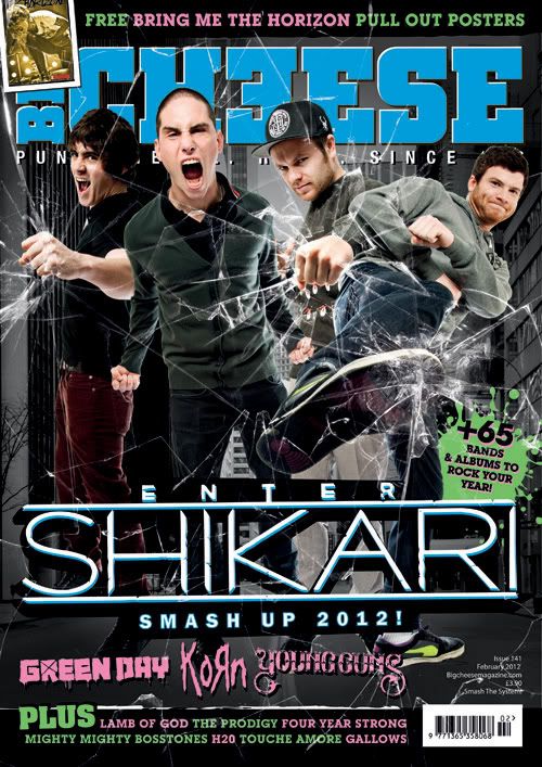 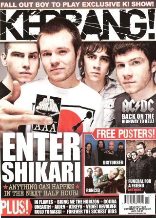
The Others Included (but not limited to):
Cover Story Ideas
In order to get the latest news on the main three artists, Paramore, Bring Me The Horizon and Enter Shakari, I utilised Google's 'News Search' function, and found a couple of the current top stories surrounding the artists.
   
Rock on The Range Rock on The Range is a rock music festival taking place in May of 2016 in Columbus, Ohio, America. Some of the biggest names in rock will be performing there, These include:
Possible story ideas for my magazine:
|
Subscribe to:
Comments (Atom)